
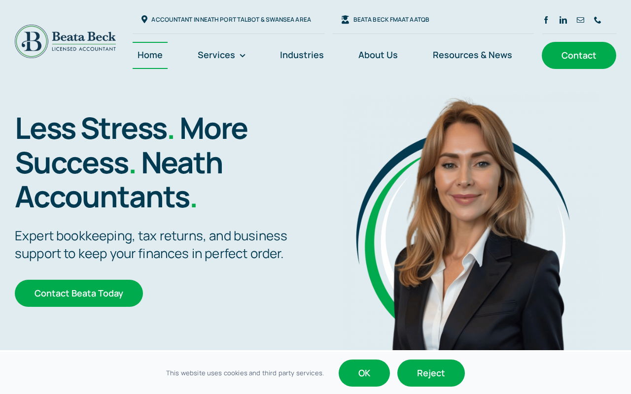
A refined personal brand site with editorial typography, considered colour and a clear narrative arc — built to scale as her practice grows.
The challenge
A growing personal practice needed a digital presence that matched the calibre of the work — premium, personal, unmistakably hers.
Our approach
We developed an editorial design language: expressive serif headlines, generous whitespace and a restrained palette.
The site is structured to grow — services, writing and speaking can each expand without redesign.
Premium
brand perception from day one
+85%
enquiry quality (self-reported)
Future-proof
structure that scales
Next project
ReconovaWant a build like this one?
Tell us about your project — we'll reply within one working day with honest advice and a clear next step.